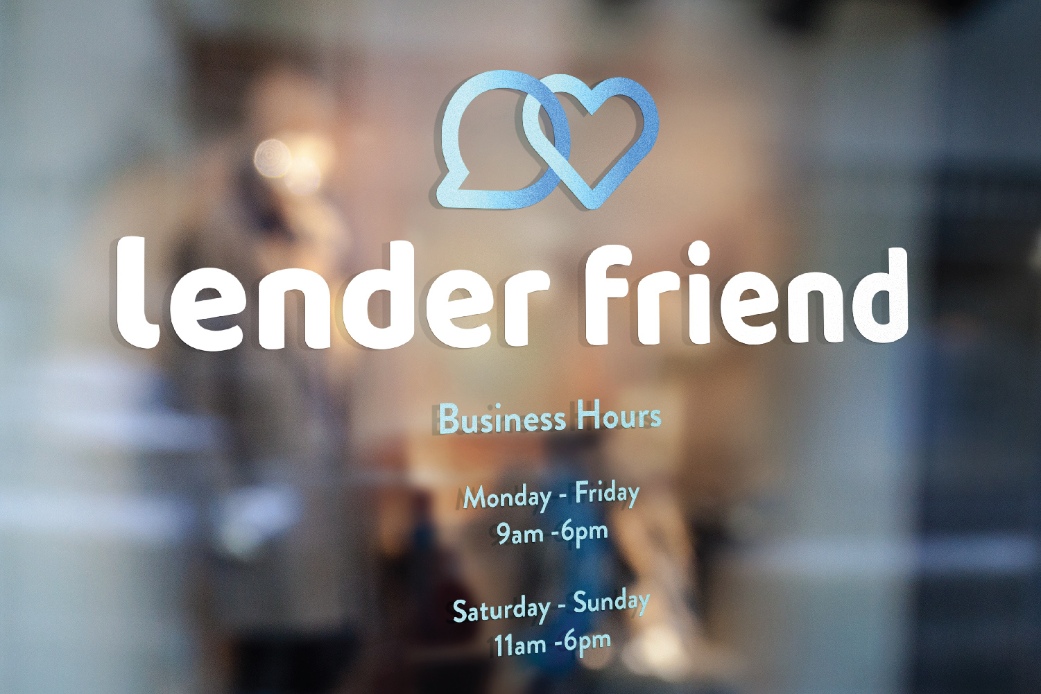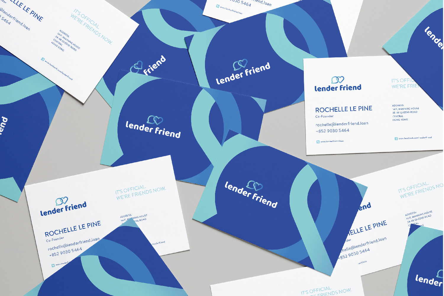

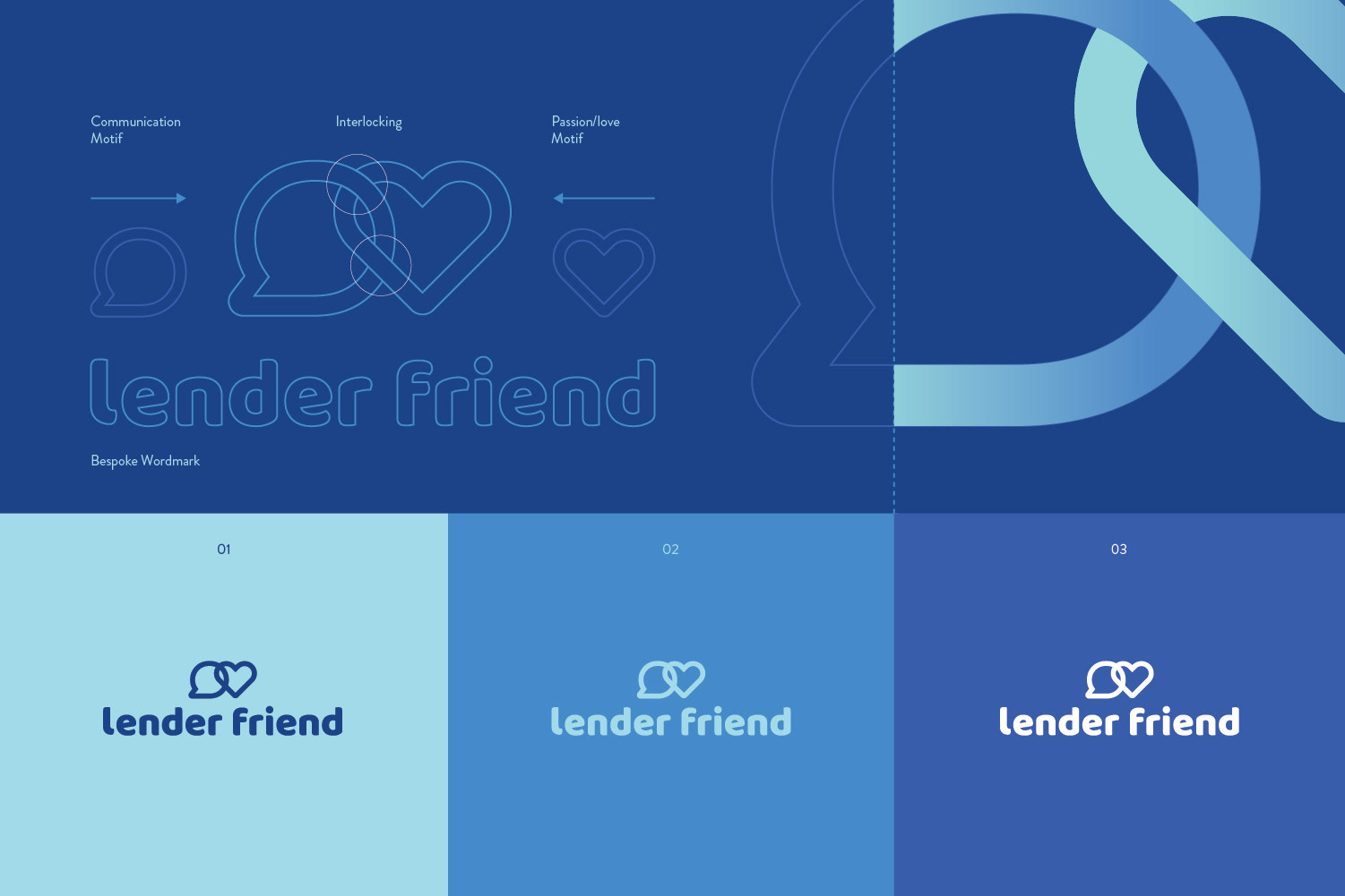
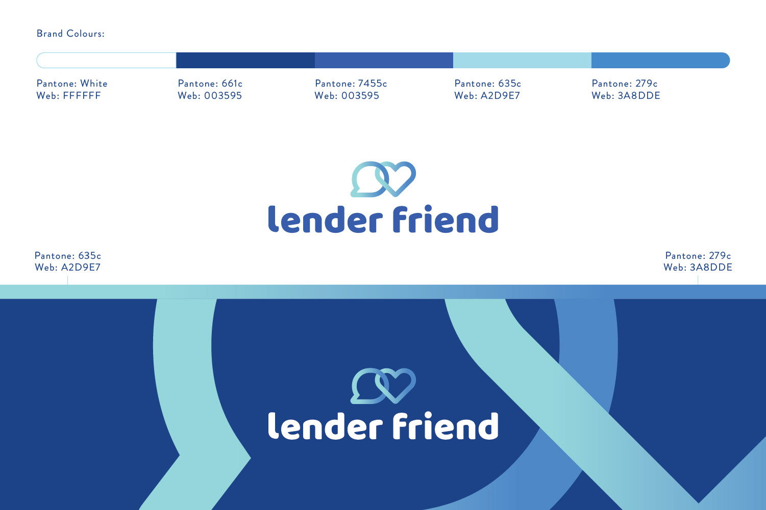
The logo mark was developed to portray Lender Friend’s core values as a company.
1) Create clear, simple and easy communicative options for migrant domestic workers in Hong Kong.
2) Always build, react and act on positive emotions that create a sense of empathy and trust with lender applicants.
We were able to link these two main ideals by interlinking a speech bubble, representing communication and a heart, representing love and passion.
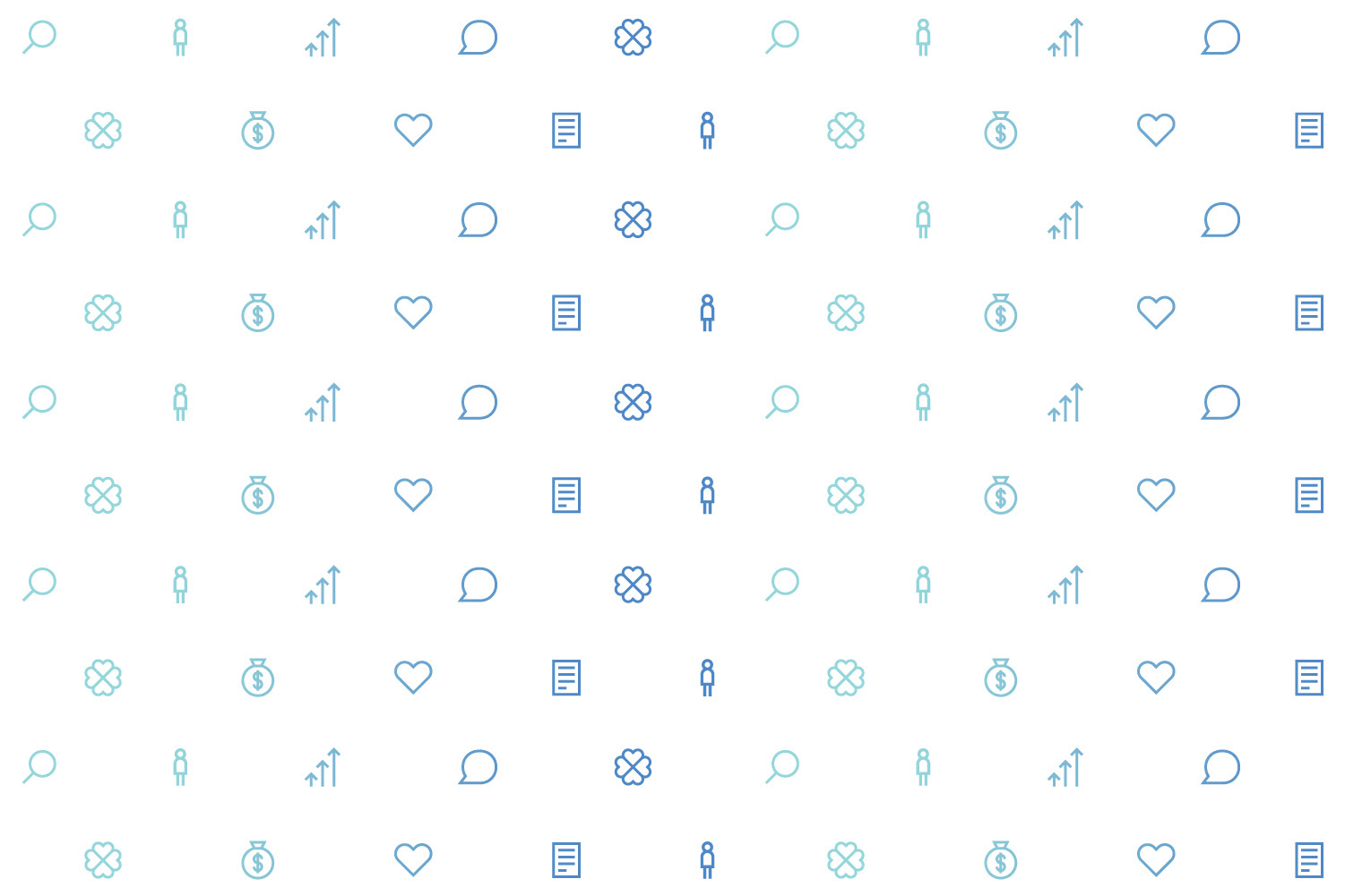
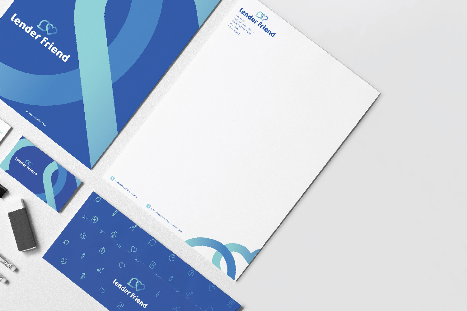
As with all projects, we approached the colour palette selection with care and intent.
After many colour variations and tested content within the community, we settled on a cool palette of colours that range between a “fun and energetic” aqua to darker tones of “royal blue”.
The aqua conveys energy while the other tones of darker blue tested positively with conveying sense of trust and aspiration. Our colour choices run parallel with traditional financial institutions and portray a sense of trustworthiness to users because of this.
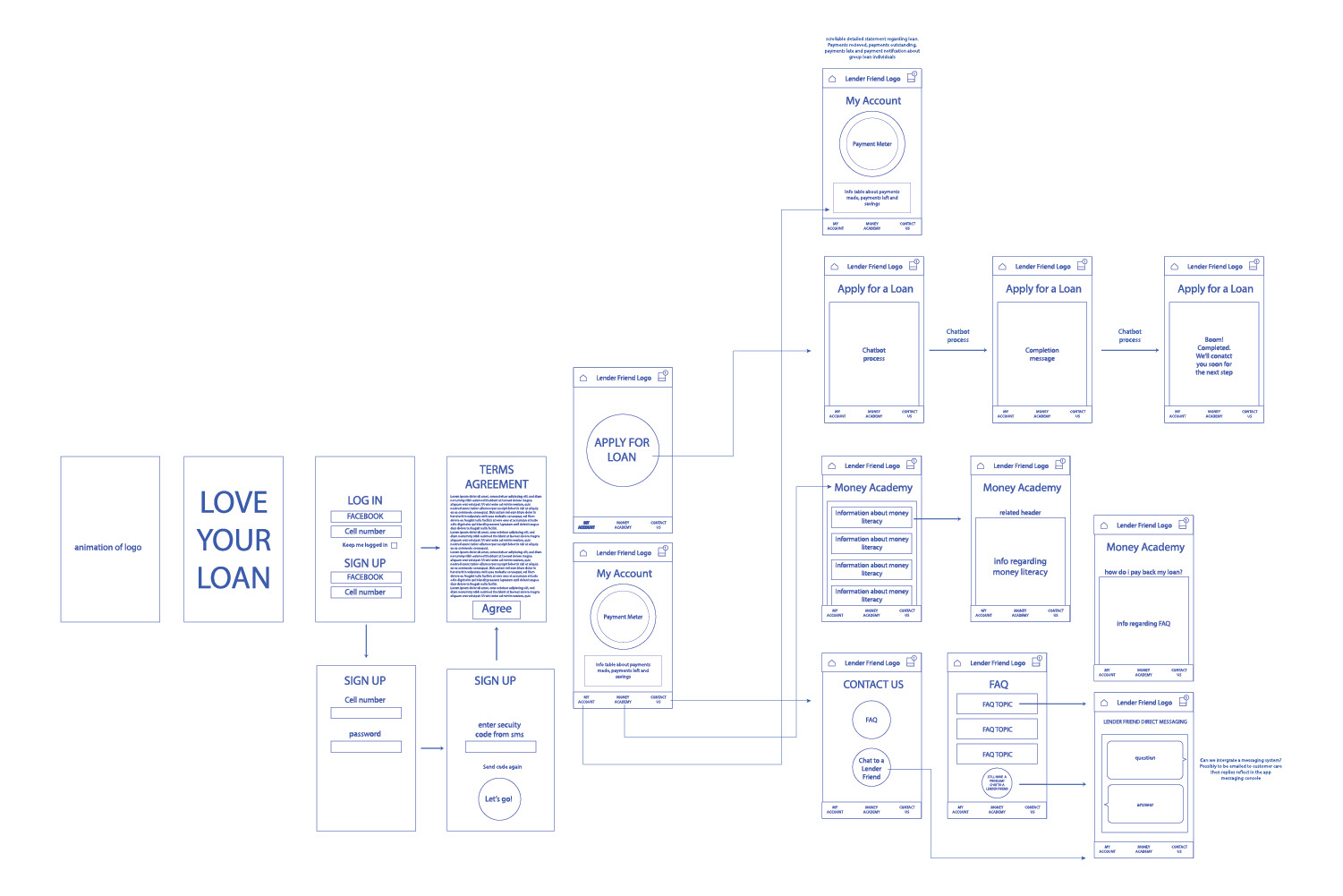
We helped develop the app and made sure the customer journey was in its simplest form. It had to be easy for anyone to understand and navigate. Clarity and simplicity was very important for us when designing the user interface as we want users to not feel overwhelmed in a situation that may be stressful for them.