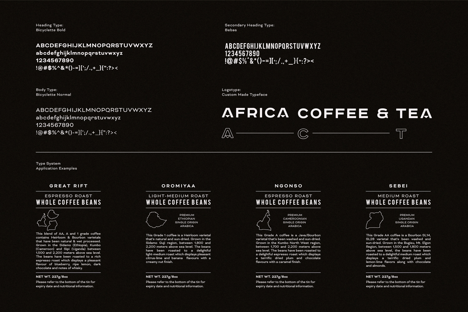
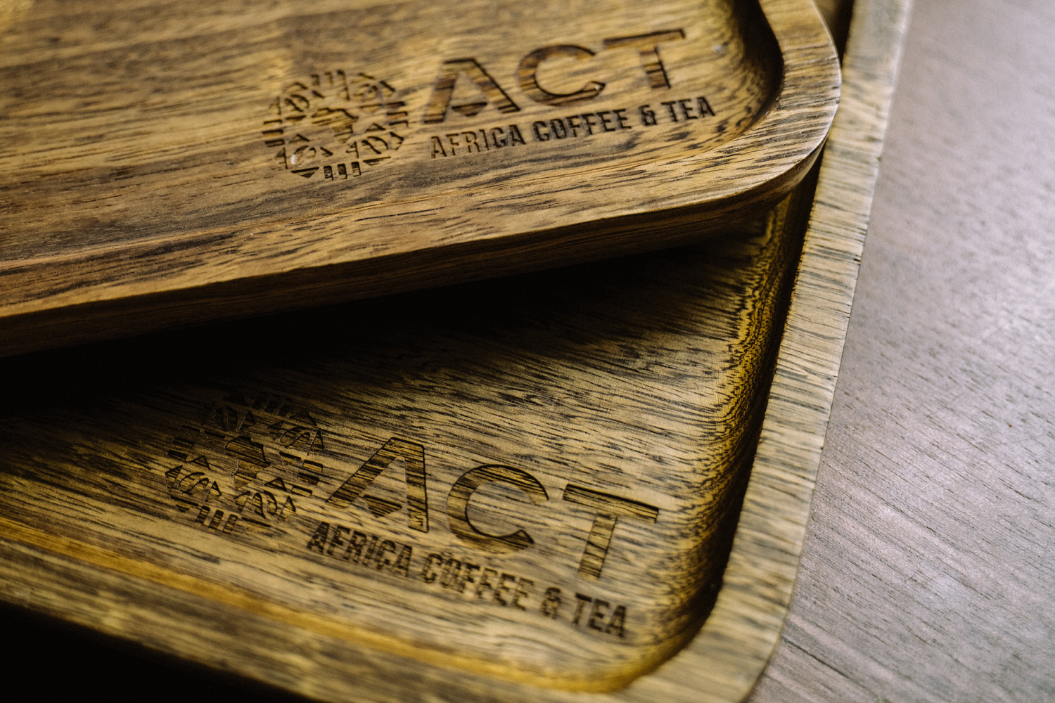
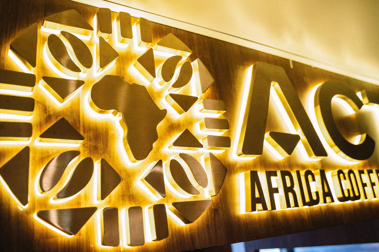
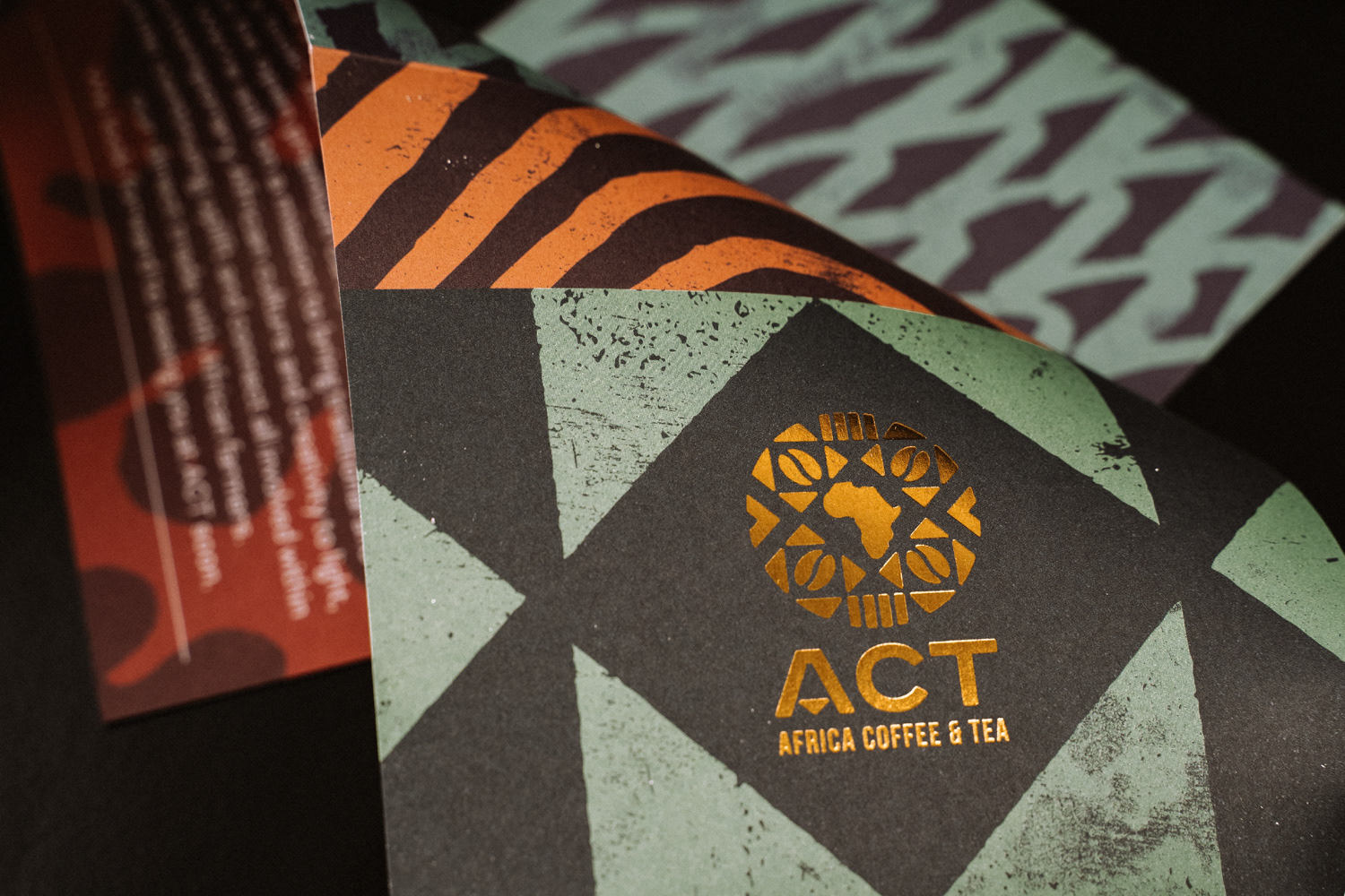
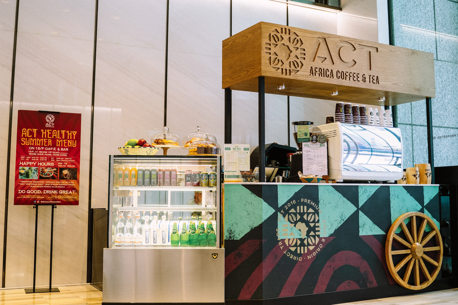
We created a modern sans serif typeface that was customised to incorporate triangular pattern work that was also used in the icon we developed.
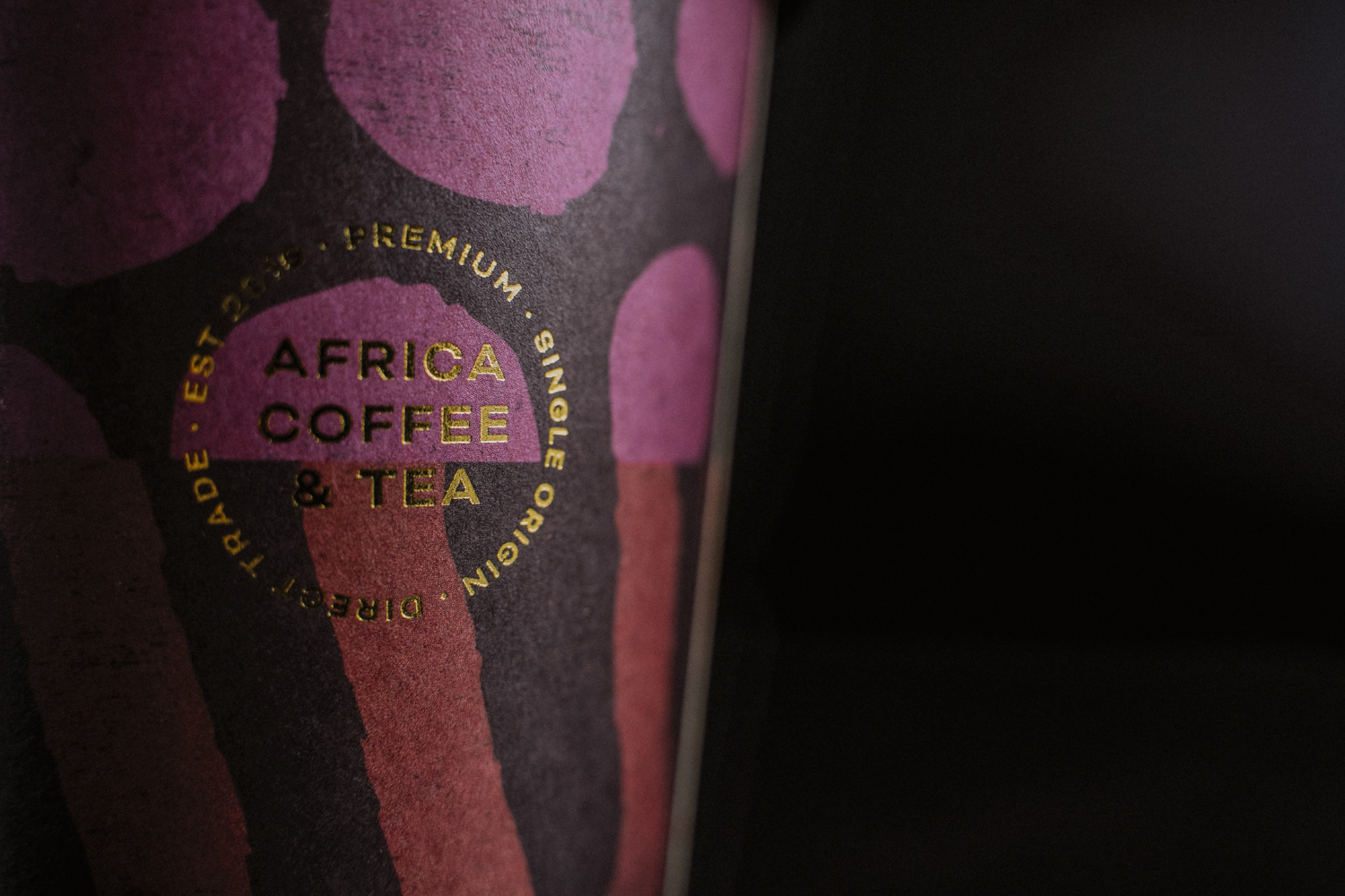
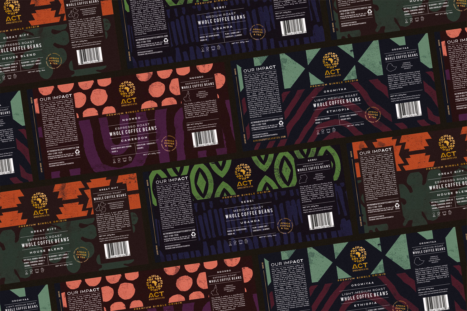
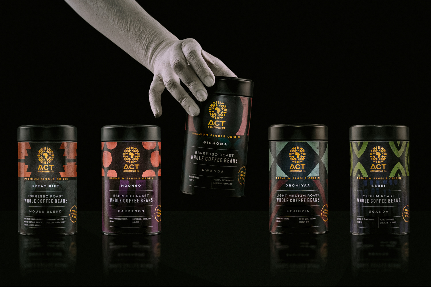
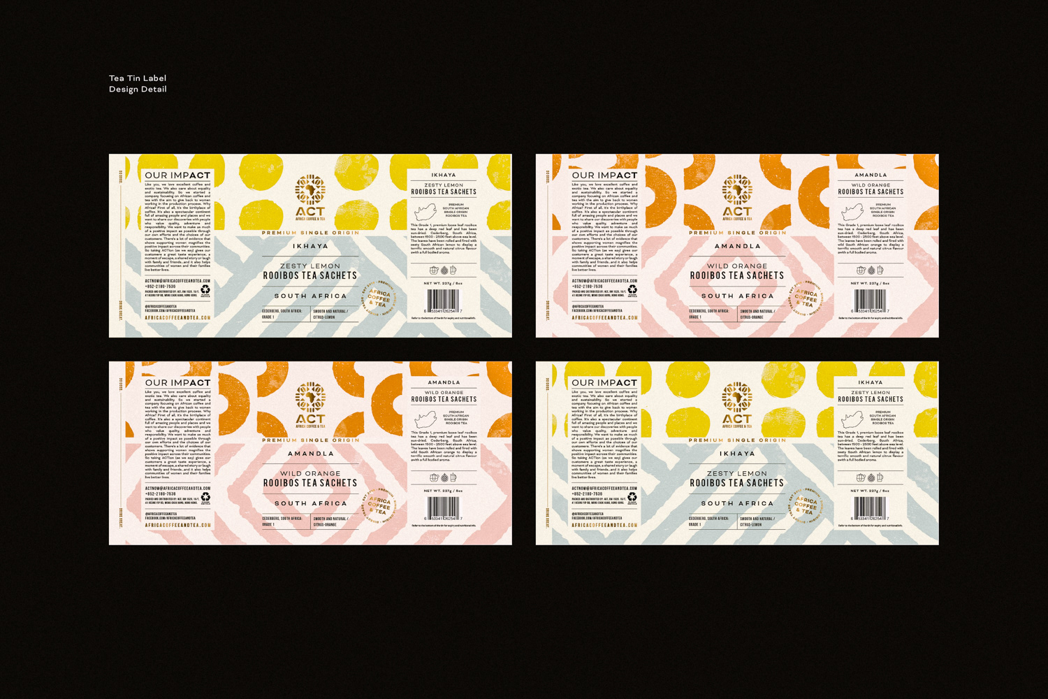
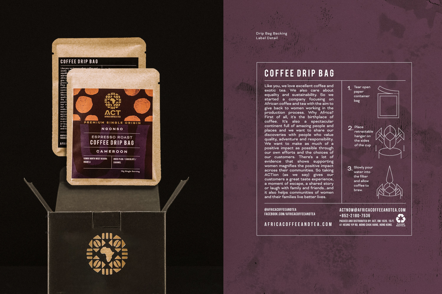
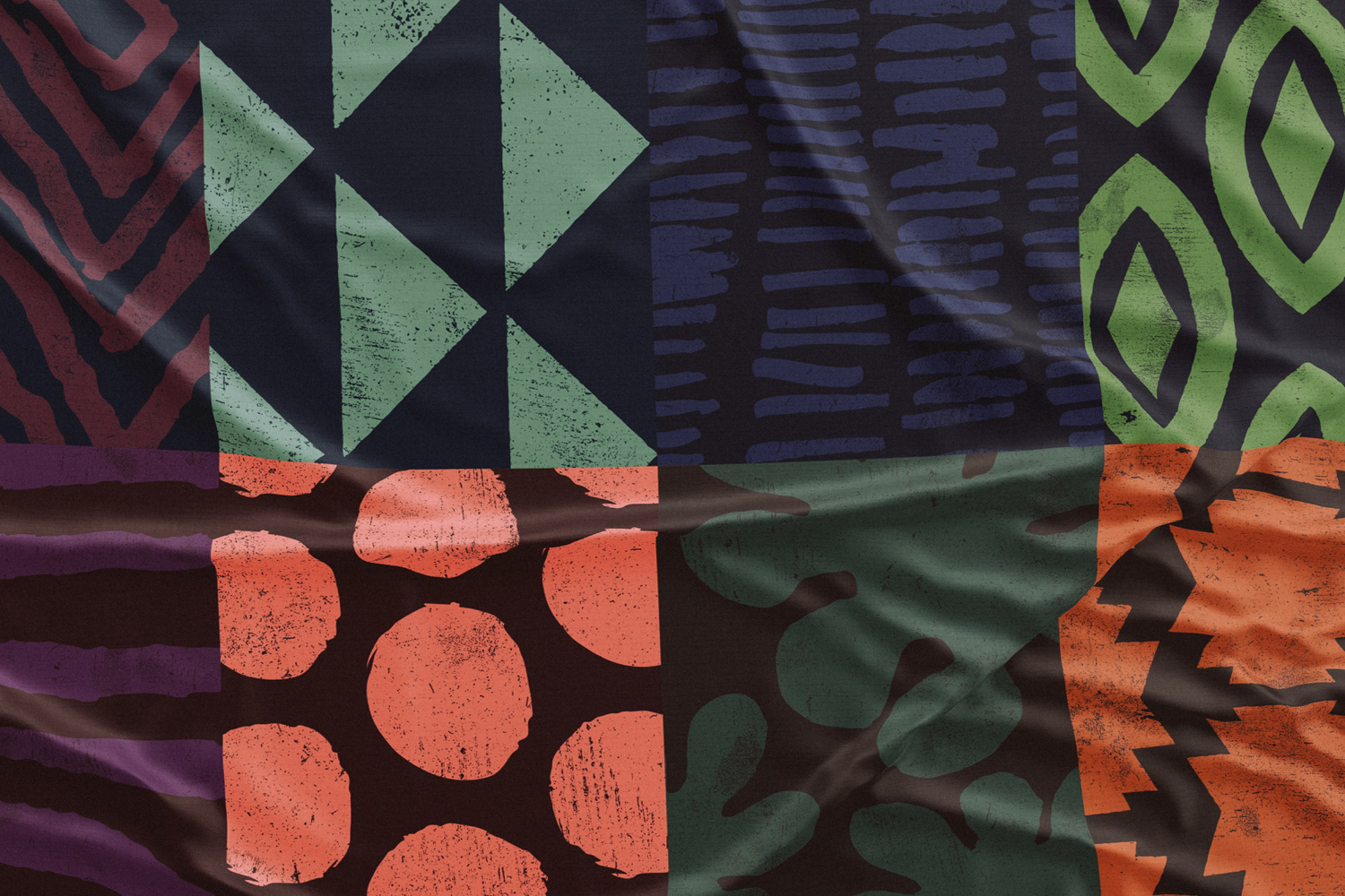
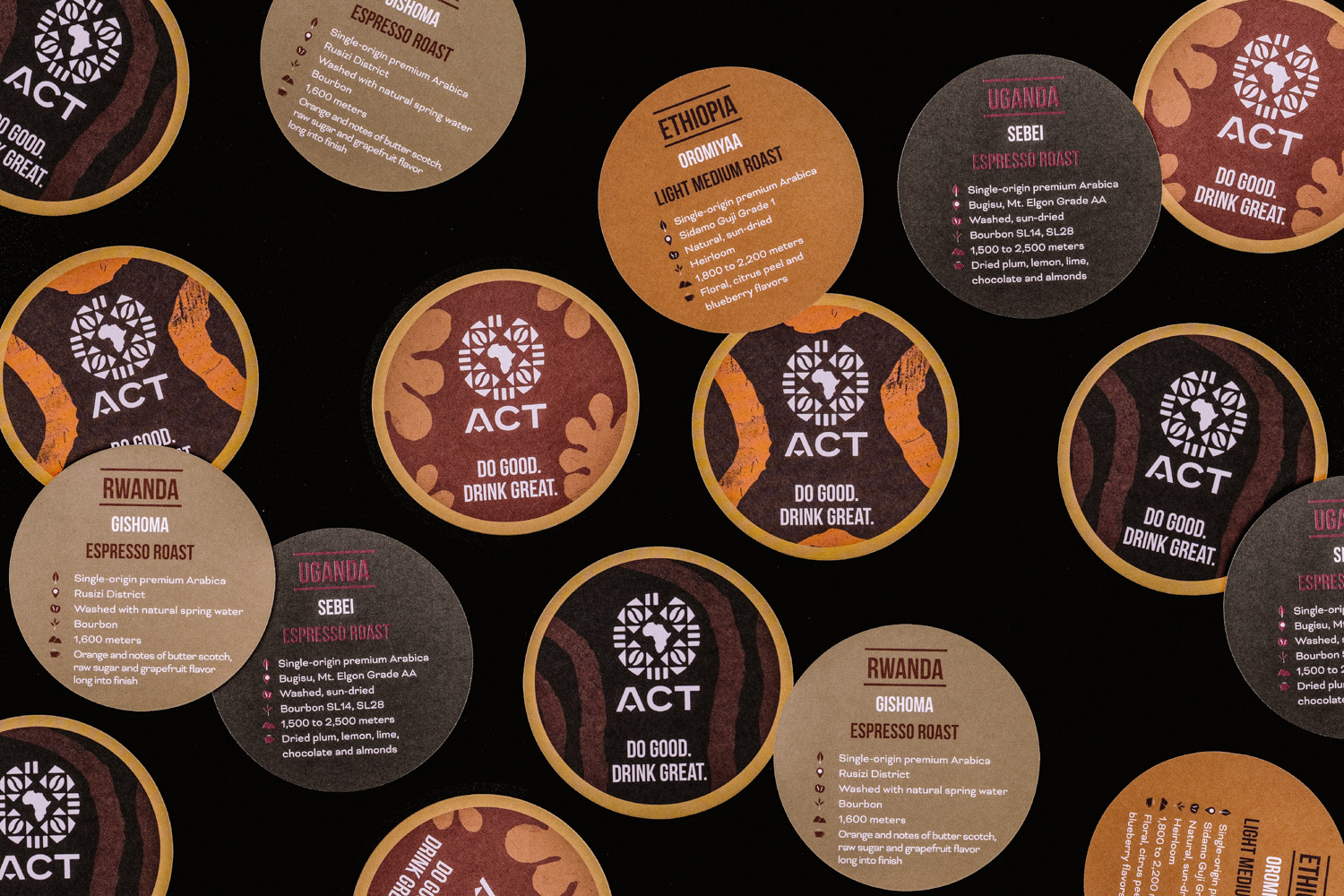
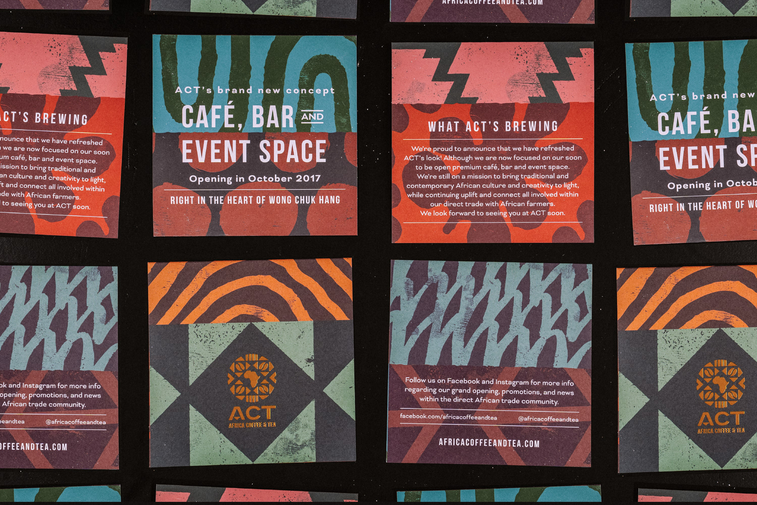
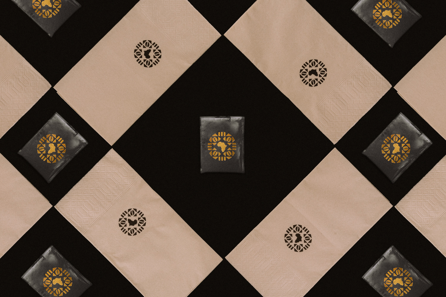
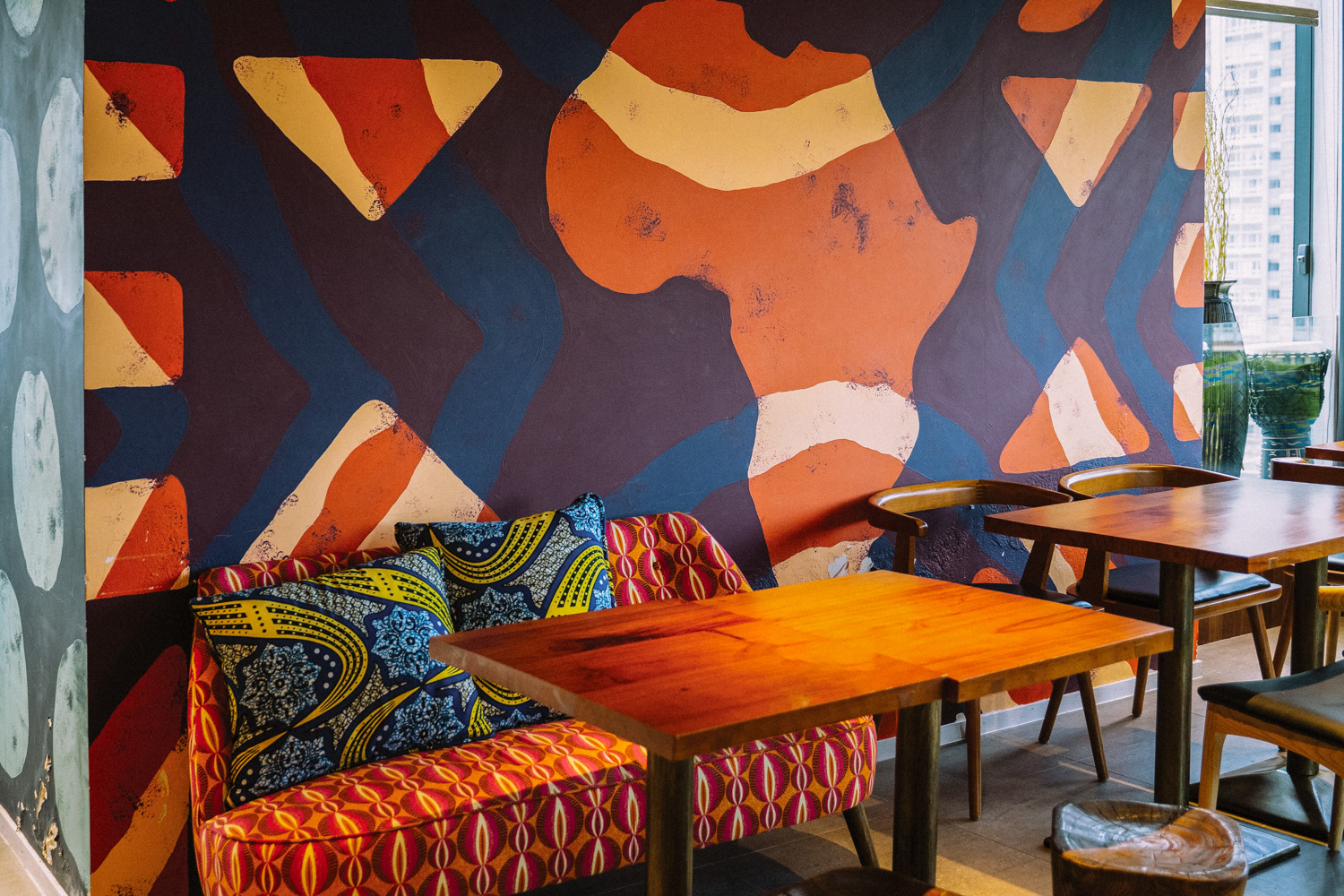
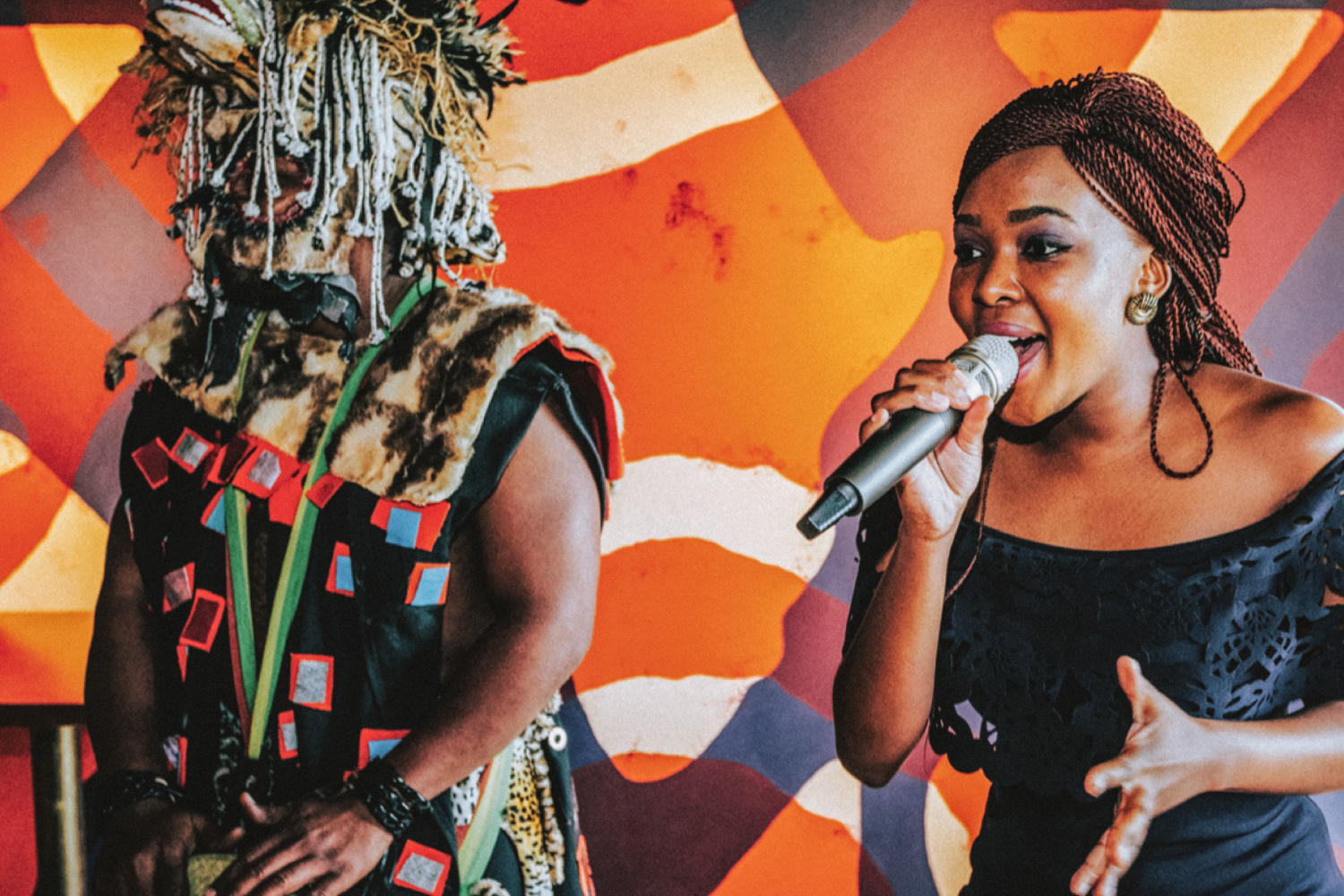
Patterns and colours used were inspired by the different African coffee growing regions. The layout, Intricately placed details, and gold foil accents give this lavish brand the feeling of Africa without being too cliche.

Colours used reference the earthiness in origin and flavour of coffee. Raw textures on bold shapes emphasize the same earthy feeling and pay homage to tribal artwork but are used in a more modern and luxurious way.
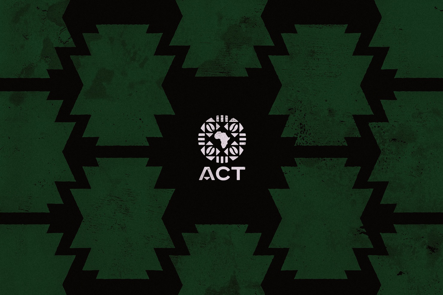
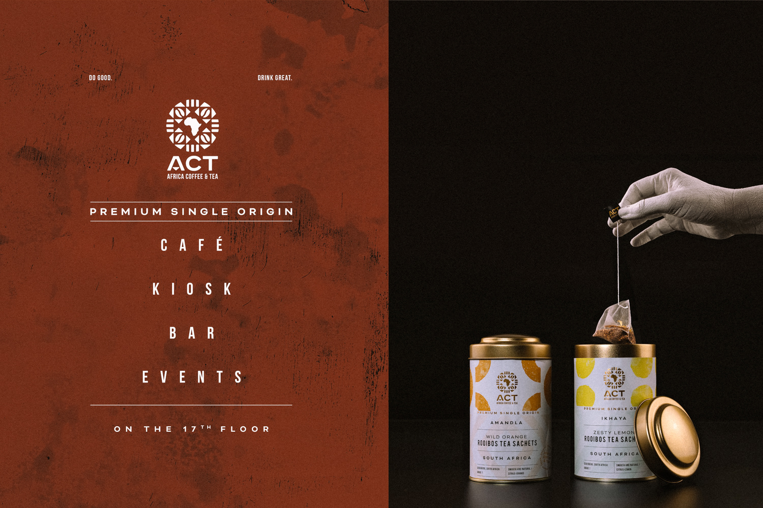
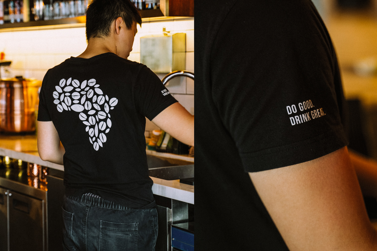
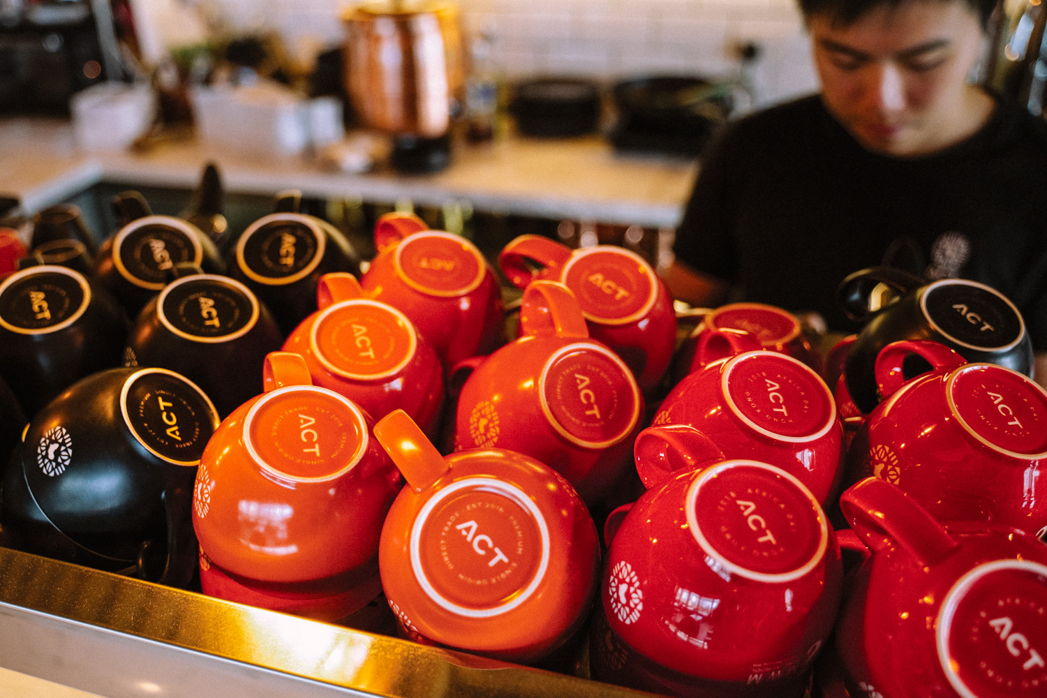
Thinking that the name, Africa Coffee & Tea, read too long, we helped owner Charlene Hua rename the brand to a shortened, abbreviated form of ACT which corresponds to her humanitarian ambitions. The name ACT is another way of highlighting the work done in by the brand in helping give African refugees a brighter future as well as supporting local women in the African coffee regions their goods are supplied from. ACT aims to encourage people to make sustainable, conscious choices that make a positive impact on their community.


Photography by Gideon de Kock